
The wide variety of marble stone aesthetics provides plenty of potential in achieving the room colour schemes you’re looking to achieve in interior design.
Using marble in interior design allows you to achieve a timeless elegance in your home design–but ensuring a cohesive colour palette is very important in doing so effectively.
In this article, we’ll guide you through everything you need to know to achieve a balanced, beautiful colour palette interior design.
Colour Palette: The Essentials
When you’re considering your chosen colour palette, consider the palette as essentially a roadmap for your space’s colour scheme.
Having a cohesive colour palette is about achieving a balanced aesthetic and ensuring that there are no mismatched tones that might provide a clash of visuals.
Many people are pleasantly surprised by the wide variety of different colour schemes available in marble. While the iconic white and grey-veining is an iconic form of the stone, it is far from the only option you have for colour combinations in your interior design.
So, how do you incorporate a cohesive interior design with your marble’s colour palette? Let’s break it down for you.
Creating a Cohesive Colour Palette for Interior Design
1. Define your vision
When we talk about defining your vision, we are not referring to any special ability to conjure a picture perfect mental image of what your home will look like.
Your vision, by contrast, should be your overall objective. What is the tone and feeling you are trying to create with your colour palette? Do you want something bold and dramatic, luxurious and opulent, or something calming and minimalist?
Knowing what you are looking to achieve will help you find the right marble to complement your colour palette.
2. Consider the room’s function
Colour palettes need to be cohesive but they also need to be reflective of the type of room in the house which you are designing.
For example, you might want a certain element of relaxation in a bathroom. Whereas, in a kitchen, you’re opting for a more high-energy, activity-driven sort of feel. The function of the space should be enhanced by the colour palette of your choosing–not stand out in contrast to it.
3. Identify the marble’s dominant colour
One of the fantastic features of the metamorphic process by which marble stone is created is that it provides a rich aesthetic which can include multiple colours in complex, unique patterns.
When you find a marble slab that you love, take the time to have a closer look. Often, the dominant colour is obvious. For example, white marble with grey veining is easy to identify. But there might be more complex colour palettes as well, such as warmer creams with hues of brown accents. Even blue, red, pink, green, gold and black marble can feature a variety of different hues and colours.
Take the time to look beyond the obvious and determine the dominant colour of your chosen marble. From that foundation, you’ll be able to build out a cohesive style.
4. Choose complementary colours
With a base colour in the bag and your intended ambience in mind, you can begin to build out your palette with more colours.
The key when working on colour combinations for interior design is complementarianism. In other words, which colours match your foundation colour.
Many interior designers find the classic colour wheel a good guide for choosing matching room colour schemes.
5. Add accents and textures
In addition to a complementary colour palette interior design is all about nuance. Don’t be afraid to use accents and textures to your advantage.
Pops of colour in the form of artwork, furniture or even a feature wall can help to not only create a central aesthetic focal point but can also be very effective in actually trying a cohesive room colour scheme together.
When it comes to texture, you can use this pivotal feature to great effectiveness. A variety of different textures can go a long way to infusing complexity into your colour scheme without ruining the cohesiveness.
6. Play around
Choosing and implementing your interior design colour schemes should be fun! Play around with different ideas, embrace new possibilities and test and refine as you go.
The key to a successfully cohesive colour palette is playing around. Paint different swatches, use different fabric samples and even try a variety of different art features to help slowly refine your choices to what works best.
Don’t be afraid to experiment a little until your colour palette achieves the perfect harmonious balance you’re looking for.
Colour Scheme Examples
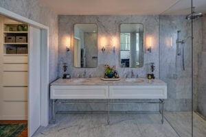
Calacatta Belgia Marble
- Dominant colour: Cool white with subtle grey veining
- Ambiance: Relaxation and serenity
- Use: Bathrooms
- Suggested colour palette: Pale blues, grey-beiges, and light greys
Ebony Black Marble
- Dominant colour: Bold black with some subtle off-white veining
- Ambiance: Sophistication and dramatic mood
- Use: Living room
- Suggested colour palette: warm whites, brushed golds
Crema Marfil Marble
- Dominant colour: Warm cream with some light brown veining
- Ambiance: Warmth and naturally inviting
- Use: Living room and dining spaces
- Suggested colour palette: taupe and terracotta
A World of Marble Awaits: Explore Euro Marble's Extensive Collection
Finding the right room colour schemes for you should be a fun and enjoyable process. But if you’re finding it overwhelming or are still not sure where to begin, don’t worry! The team here at Euro Marble can and would love to help.
Come on in to our showroom and we’ll show you around our full range of marble colours and help you make the right colour palette choice for your interior design.
You’ll find us at 11 Rich Street, Marrickville. Or you can contact us at sales@euromarble.com.au and by calling (02) 8585 2999.